Icon Box
Create and display an Icon Box element containing an icon, title description with different settings
Options#
Option nameDescription
| Title | Title text. |
| Description | Description text. |
| Link Type | Link type of the icon box. |
| The link | Add a link here. For call to action button, title is used as anchor text. |
| Icon Type | Type of the icon. |
| Image Icon | Upload an Icon Image. |
| Select Icon | Select an icon to display. |
| Shaped Background Icon? | Display the icon in a shape with hover effects? Available only for icon fonts to control the hover color. |
| Icon Color | Color of the icon. |
| Shape Background Color | Background Color of the shape behind the icon. |
| Icon Hover Color | Hover Color of the icon. |
| Shape Background Hover Color | Hover background color of the shape behind the icon. |
| Icon Size | Select the size of the icon. |
| Image Size | Select the size of the image. |
| Icon Padding (Shaped) | Select the size of the icon. |
| Box Alignment | Alignment for the content inside the box. |
| Text color theme | Choose text color scheme |
| Floated Style? | Is the box left or right floated? Don’t confuse with alignment. |
| Title settings | Specify the typography properties for the title. |
| Title first? | Display the title first? |
| Description text settings | Specify the typography properties for the description text. |
| Icon Opacity | Select the opacity of the icon. |
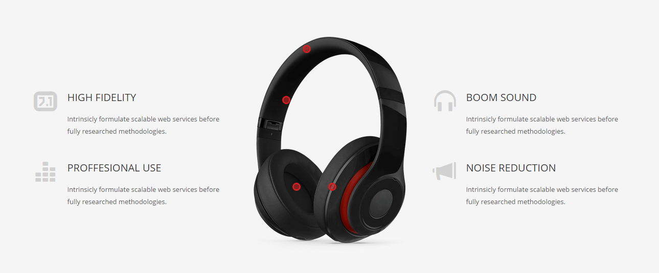
| ——- Hover Stage Points | Use the feature to display a target point onto a Stage object element. First create the Stage element and customise it, then, copy the ID below. |
| Point Target Stage ID | Copy the ID from the Stage element you want to add points to. |
| Point Coordinates | This will add an animated dot onto the stage image with the X and Y coordinates you provide. In px add “x, y” coordinates – X being distance from left and Y distance from top. |
| Point Tootip | Add a custom tooltip text. Leave empty if you don’t want to display a tooltip. |
| Appear on scroll? | Start invisible and appear on scroll, when in viewport? |
| Delay appearance (milliseconds) | Delay the appearance? If multiple icon boxes, you can delay each one to appear sequentially. The numbers are in milliseconds. |
Example#