
Common issues on small devices
My mobile content is not aligned properly#
You will need to look on the bigger devices and see if there’s some updated padding because the padding can be inherited from there.
When you update a padding to the desktop device and in the other devices you let the field empty, that device will inherit the padding from the desktop device.
In this example, you can see that there are 50px margin and padding for the large desktop.
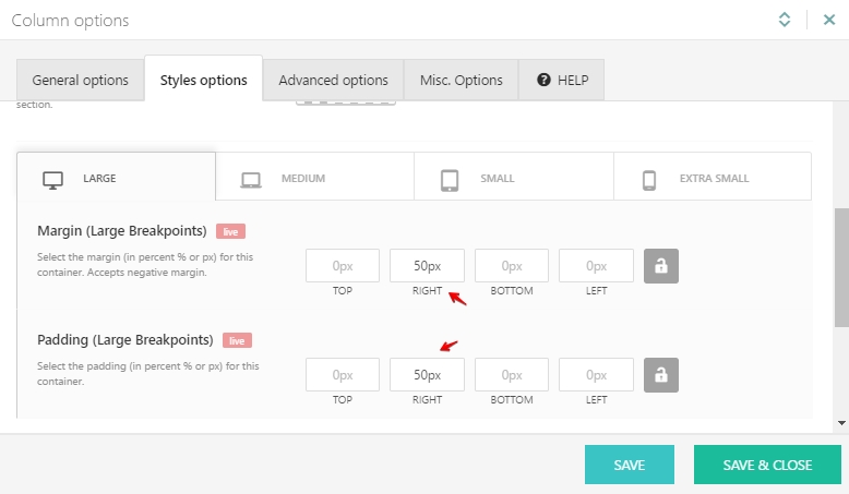
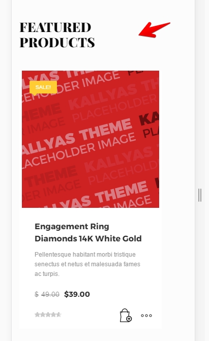
But when you go to the smaller devices the fields for right margin & padding are empty that force them to get the padding from a desktop device.
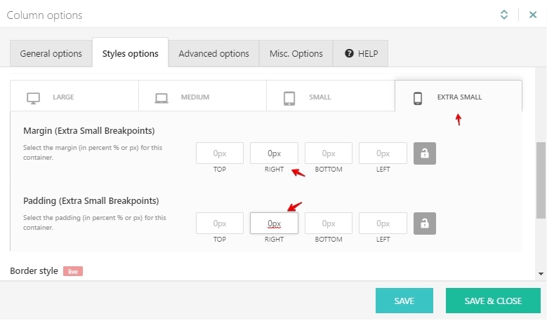
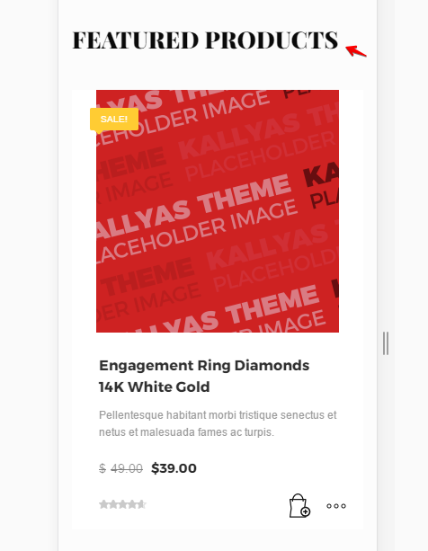
If you will change the padding and margin for smaller devices the element will be aligned properly.
#
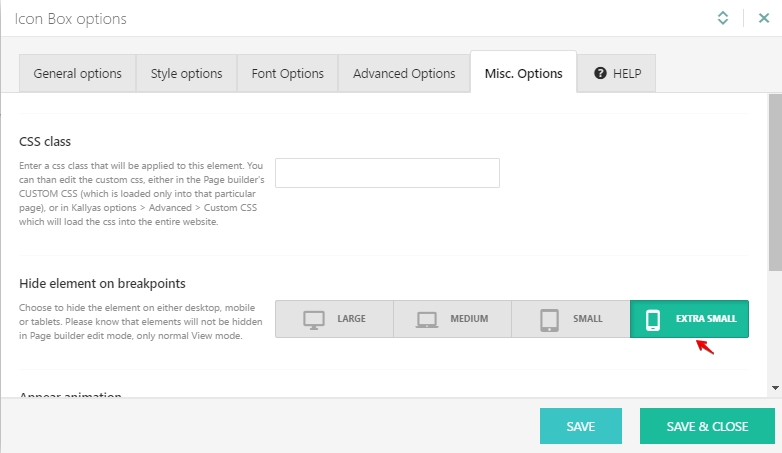
How can I hide elements on mobile?#
To achieve that you can go to your element options > Misc. Options > Hide element on breakpoints and click on the “extra small” icon.
The menu doesn’t appear at all.#
You will need to change the hamburger icon color in order to make it visible on the mobile device.
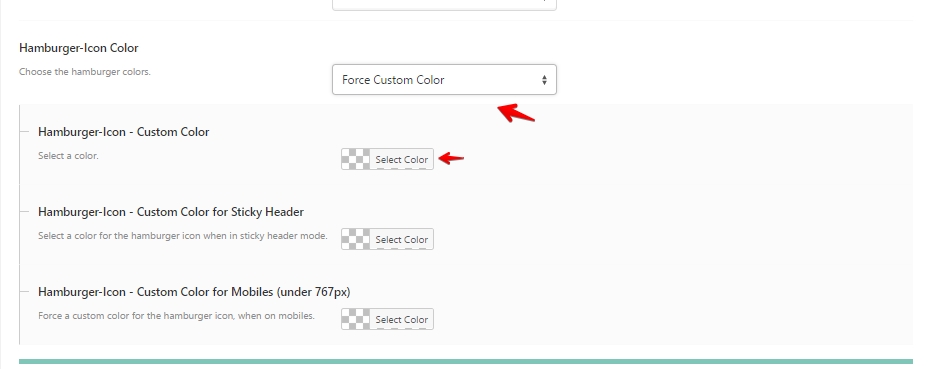
How can I change the mobile “menu burger” color?#
The “menu burger” color can be changed from Theme Options > General Options > Header – Navigation Options > Hamburger-Icon Color > Force Custom Color:
The video is not showing on mobile.#
That’s the normal behavior actually. Only a poster image (static) will be displayed. That’s because videos on smartphones or general smartphone operating systems are very problematic. Some of the problems are:
- They take over the video, modify the z-layering structure, for example, z-index. This alone generates a ton of problems;
- OS’s add own controls which are built-in the operating system and are not customizable;
- Can’t autoplay a video (bandwidth consumption protection)
- Can’t override any system option.
What will do work is videos that are inside a player, for example, a video that’s launched in a modal window, or a video embedded into the article.
So basically a video background should do what it supposed to, to display a video in the background. Unfortunately, the problems of having them enabled on mobiles are too big so this is turned off by default.
Menu links don’t work on mobile.#
This is a common problem for users who use the plugin “Navigation Overlay – Kallyas Addon” version: 1.0.9.
In this case, you will need to update your plugin to the latest version since there was an issue regarding the menu links on previous versions.
The website loads very slow#
You can try to follow this article: https://my.hogash.com/documentation/how-to-improve-page-speed/.
Videos on mobile – autoplay#
Unfortunately, videos on mobile cannot be auto-played, and this cannot be overridden (at least not without complicated scripts that don’t work on all mobile OS’s). What’s important is the fact that this is a bad practice. The reason why autoplay was forced disabled by mobile OS’s is that a video is quite large and it consumes a lot of mobile bandwidth. Imagining one is browsing through a 3G connection with limited bandwidth, it’ll load slow but it will consume a lot of his coverage. So it’s kind of like the user is agreeing to play a video, but not forced.